Friday 30 November 2012

Andy Ford's Pages

I have put together a rough version of Andy's pages to see what they would look like together, it took a lot of rearranging to get them to flow in a way that I was happy with, but I feel that the way they are displayed below works well as a set of pages.


Andy also supplied me with a couple of paragraphs axplaining why he love music and photography and the combinantion of the two. It read as follows.

"Since the day I started shooting punk & hardcore shows my goal was always to try and distill down all the raw energy & chaos of a live show into a single frame.  The kind of photograph that puts the viewer right there in the middle of all that sweaty mayhem.

I now find myself working with much bigger bands and festivals, but my aim is still the same, to try and make exciting images that give you a sense of really being there.  I try to avoid the standard ‘man playing guitar’ images you see a lot of and mix it up with different lenses and angles, always looking for those iconic moments, keep it fresh for myself and the viewer.

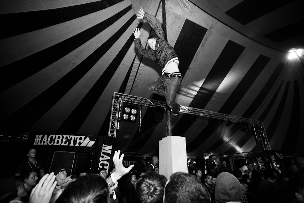
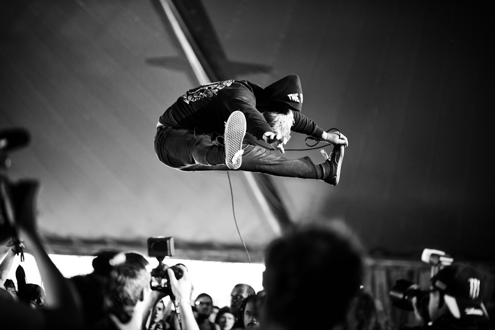
I’ve been lucky to find myself in the middle of a really exciting underground music scene in the South West over the past few years.  It’s nice to have the opportunity to work with a few big names now & then, but intense, grimy punk shows are what I truly love, once there’s someone swinging from the ceiling and a few kids back flipping off the speakers, that’s when I feel like I’m home.
"

The cover, front and rear

I have started to play around with front and rear covers for my book. For the front cover I have known what image I want to use since Andy Ford first sent it to me. I have included it below. I feel that it evokes the feel of the whole concept, it is technically well executed and a perfectly timed exposure of a live show at a festival last year. I feel that it draws the viewer into the image creating a feeling of excitement and intrigue. The darkness around the edges also allows space for text making it the perfect choice for the front cover.


For the rear I wanted to keep that feeling of mysteriousness and intrigue. I chose the below image by Greig Clifford as I feel that it complements the front cover image without being too similar.


 The only problem was however that it didn't really fit as it was a colour image and the front was a black and white. I felt that this made the two clash in an uncomfortable way. I therefore asked Greig if he would mind creating a Black and White version for the cover and we would keep the colour version for the inside of the book. Thankfully he agreed.


So the cover as it stands at the moment is screen grabbed below. The title is still a working title and I wish to disscuss this with my tutors and fellow students to see what there opinions are on the matter.

Editing through the images - Greig Clifford

Greig has also supplied me with 10 images, he often works along the idea of creating composites of live shows creating something very different to normal live music photography images.

below is a screen grab of my final 7 images for Greigs section. I feel that each images offers us an insight into what Greig is all about Photographically.


I really like the first image (image 1) so I am going to play around with this on the rear cover of the book to see what it looks like.

Editing through the images - Andy Ford

Andy has supplied me with ten images that he wanted to represent himself within the book, i wanted to take this number down to just over half. Seven images for each Photographer felt like it would be sufficient to get the readers interest without overloading the reader.

See below for a screen grab of my selection process using Adobe Bridge CS6.


Below is my final selection of Andy's images, now I need to work out the best order to display them in the book, the main things I need to take into account for this decision process is page layouts and how images will work next to each other. I have already decided, after playing around with Blurb.com, that each image is deserving of its own page. therefore the only clashes in images will be pages next to each other. Images 3 and 7 really stand out to me so they will get full bleed, but some others I may include black on the top and bottom or on both sides depending on whether they are portrait or landscape.


Wednesday 28 November 2012

Blurb.com

I have been playing around with Blurb.com this morning. It is a program I have used in the past, but not for a long while so it took some time to remember some of the processes. 


The first step is to choose the size book that you want. I went for a 13x11inch landscape book, this I felt would show the images in there best format; as most are composed in the landscape format and music images look best nice and big. 


Obviously the best option here was to go for the Photo Book option.


I actually chose tho add the images as I edited the book as opposed to straight away, this was becouse  I already had them laid out in Bridge in the correct order I required (I am referring to the images that I have ready, I am still waiting on some others).


 I wished to have as much creative control as possible so I opted for the 'No' option here.


I truly felt that the Darkroom option was best to display the images, it others the feeling of being in the dark music club with the Photographer placing the viewer right there in the action. Images also always look better surrounded by a darker colour. 


I am now ready to start editing my book.

eBook vs Printed

I have been convinced that I had wanted to produce an eBook throughout this whole project, I have however changed my mind. The concept behind the book is all about the love and passion that goes into music and photography by a small majority of the huge numbers of people who take a camera to a show. Why would I belittle this love and passion of the Photographers who have contributed to the book by just showing the images on a screen. That surely is what all the other Tom, Dick and Harry's do and that's what I want to fight against. I have therefore decided to go down the printed route, either using Blurb.com or Lightroom 4 (with a third party printing service). The beauty of a printed book is that you can always save it as a PDF and distribute it as a eBook as well if the demand is there.

Wednesday 14 November 2012

Current Photographers showing interest

I currently have two Photographers interested in providing images for this project, I am waiting to hear back from others still.

Andy Ford of Andy Ford Photography has supplied me with the below screen grabs to choose from and to start planning layouts etc.


I am still waiting on images from the other Photographer that is interested, once I have these that will be three Photographers (including myself) who have provided imagery.